My team and I redesigned the website of the JOLT Foundation, improving their overall web presence and establishing them as a professional organization involved in harm reduction and drug awareness.
The Client
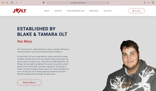
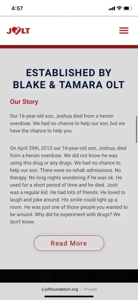
The JOLT Foundation is an organization dedicated to bringing awareness to drugs and making a difference in harm reduction. After the death of their son, Blake and Tamara Olt founded JOLT to reduce the harm related to drugs and prevent overdoses. Their foundation has greatly helped the Peoria, IL community with services such as naloxone distribution, drug testing, counseling, and more. We learned of this foundation through our Advanced Web Design class in Spring 2021 at Bradley University when we were assigned to redesign their website.
The Problem
JOLT’s original website felt outdated. Parts of the site hadn’t been updated in four years and many pages could easily be combined for better organization. From a design standpoint, the site felt dark and dreary with mostly grey colors and very few bright shades. There wasn’t enough use of imagery or personality throughout the site. This, along with the darker colors, made it hard to feel interested in the site and the foundation as a whole.
There was also a lack of hierarchy in many pages making it hard to read and stay involved. Oftentimes pages would simply have links that took the user to a different site or a blurry image with no explanation. The homepage didn’t have a lot of insight as to why JOLT was the ideal harm reduction foundation to help the people of Peoria. While the site was able to explain what the JOLT foundation was, it wasn’t able to do it in a way that felt properly designed, organized, or personable.
My Role
My role in this team was visual designer. This lead me to having a lot of input in terms of design. I would help with color scheme, icons, imagery, as well as the overall look of the site itself.
Timeline
This was completed in Spring of 2021, starting in January and ending in May. the whole website was completely redesigned and rebuilt during this time.
Tools
Figma
Adobe Illustrator
Trello
The Original Design
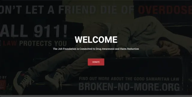
Home Hero Image —
The hero image is dark and fills up a lot of space and the text has little information about the company.
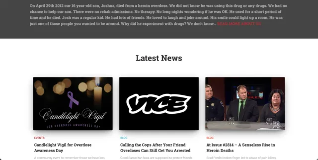
Home After Scrolling —
An outdated and not recently updated blog feature is present and the design is overall poor.
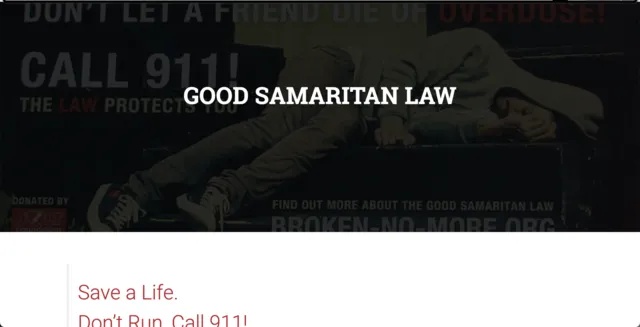
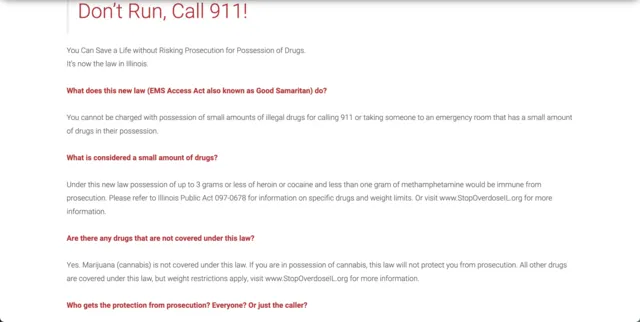
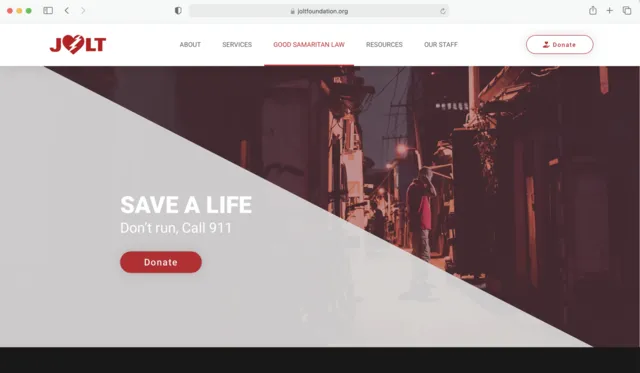
Good Samaritan Law Hero Image —
Same hero image as the main page and very little information on what this page is all about.
Good Samaritan Law Cont. —
Not much hierarchy or visual elements to make this page readable and interesting.
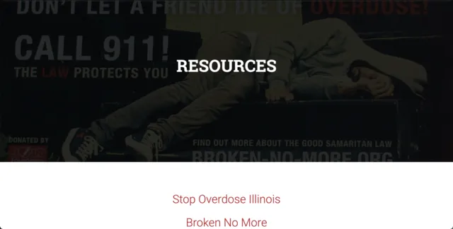
Resources Hero Image —
Again, the same hero image as all the rest and only the title with no sub title.
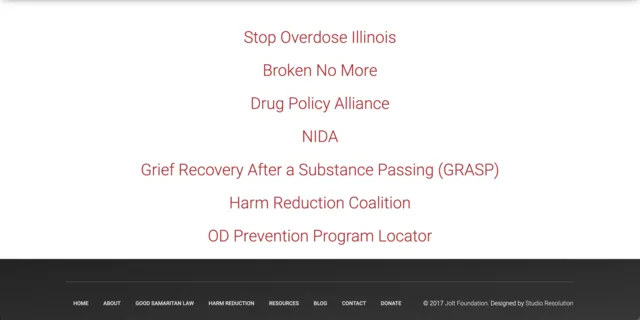
Resources Cont. —
A viewer would have no idea that these are links as well as no understanding as to what kind of resources they are.
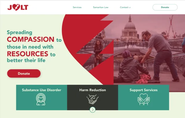
Initial Design Concepts
Our team fully redesigned this website with the growth of the JOLT foundation in mind. We used the Storybrand marketing model in order to present JOLT as the ideal organization for any interested parties. By showing JOLT as the guide and the user as the hero, JOLT is introduced as the foundation that is the most knowledgeable and experienced in the subject.
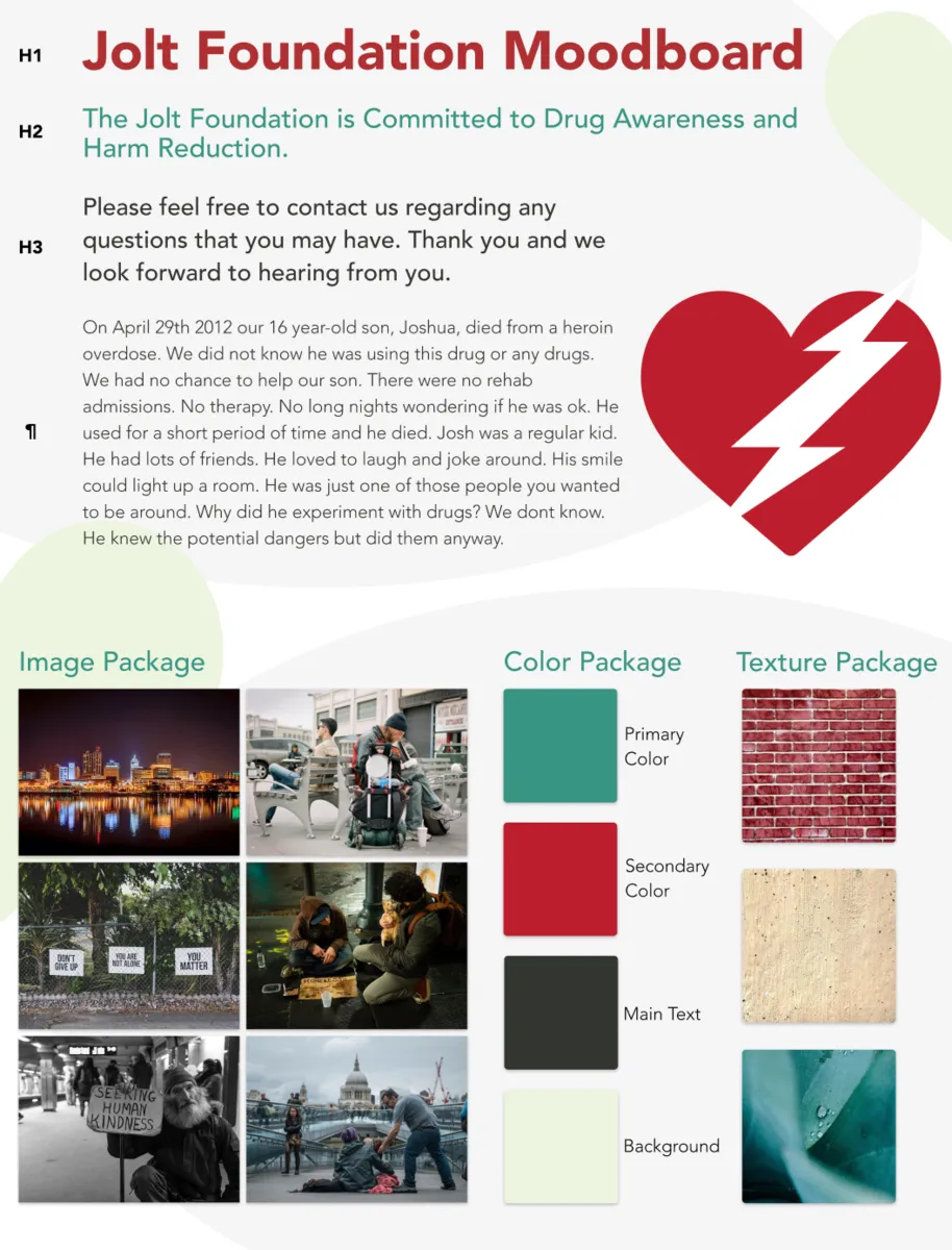
We started by discussing various color schemes and creating a mood board with our favorite ideas for typography, textures, images, and more. We eventually decided on the original color scheme of the site as that is what the client felt would be most appropriate.
Moodboard —
Multiple Color Scheme Ideas —
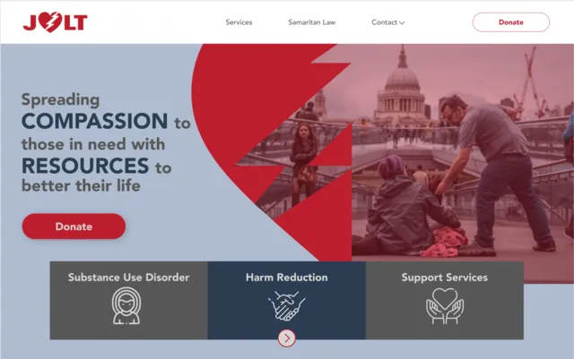
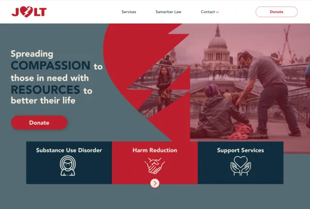
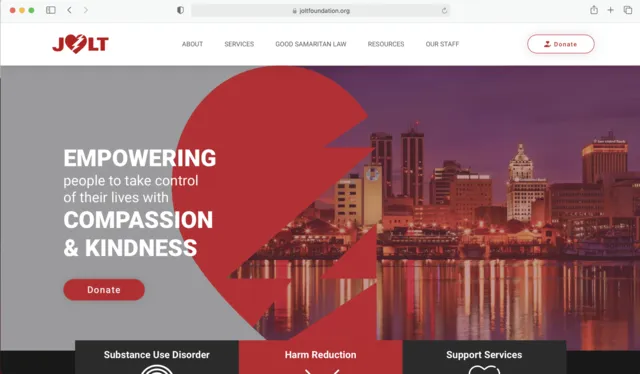
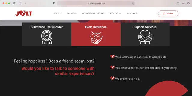
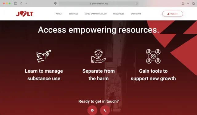
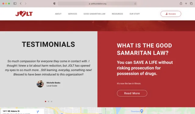
The Final Redesign and Rebuild
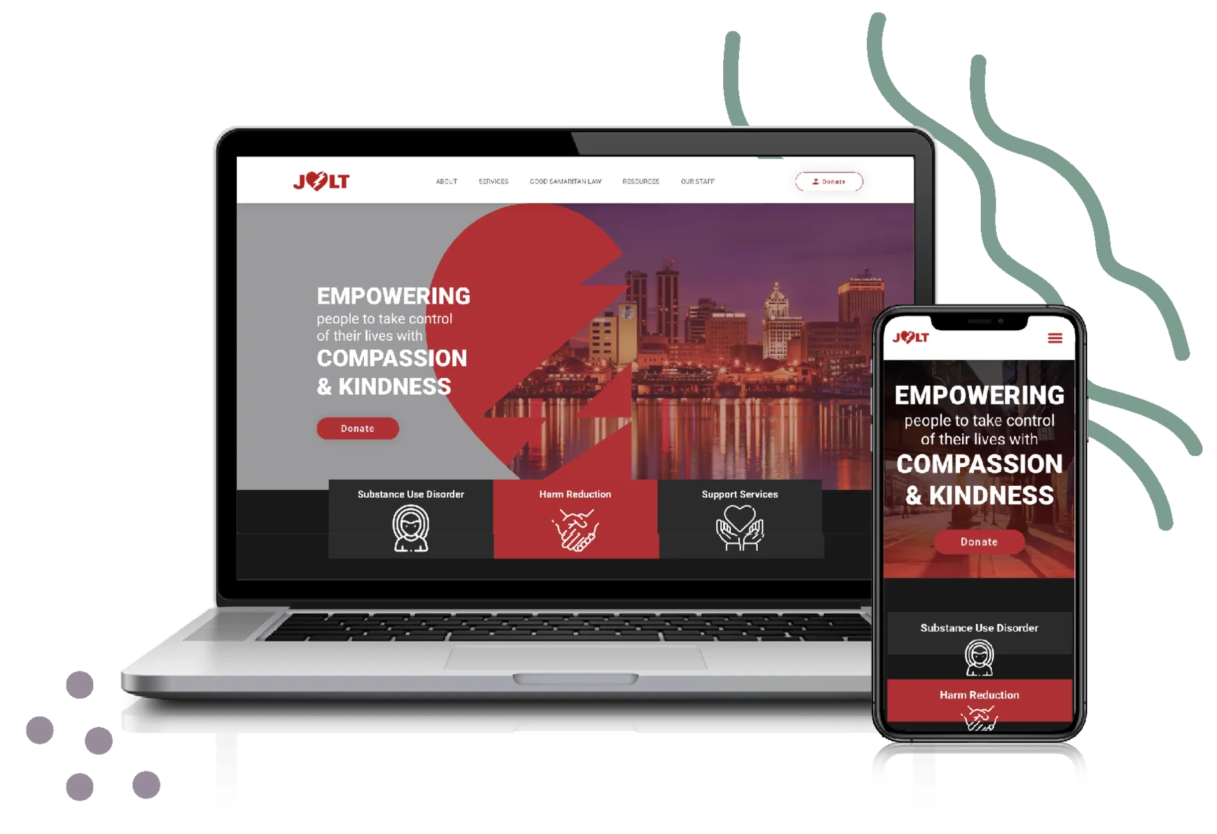
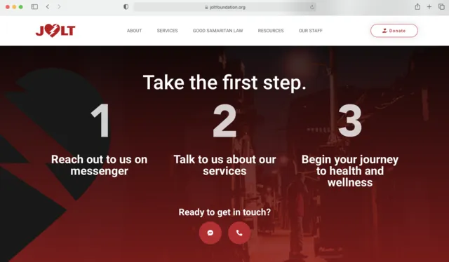
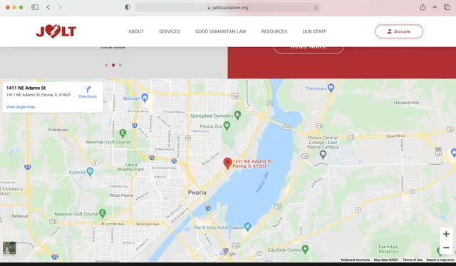
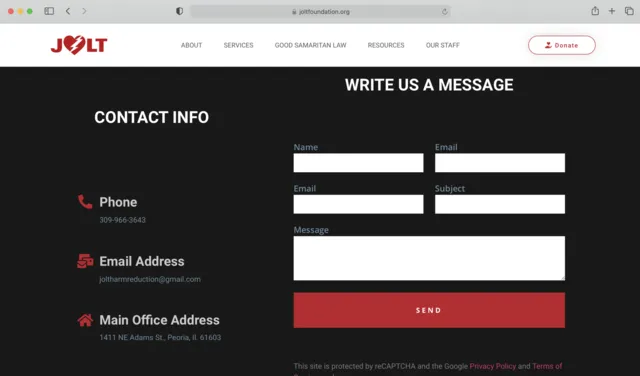
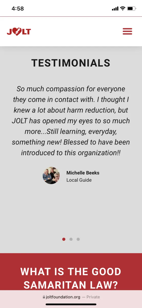
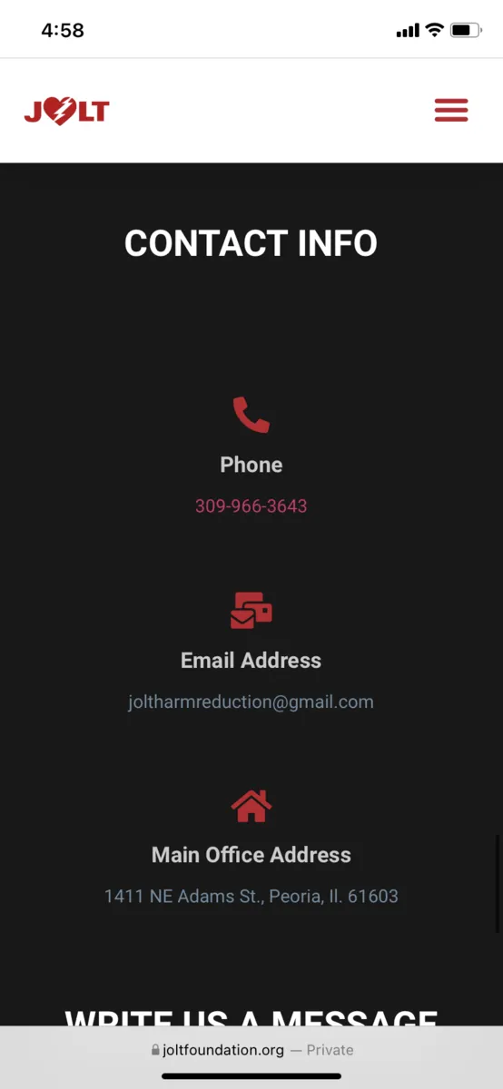
We decided to keep the same color scheme but used the brighter colors more frequently. We also used more gradients throughout the site as well as plenty more images and icons. However, our biggest design change would have to be organizational. By combining pages and deleting others that were unnecessary, we were able to more simply explain the benefits of JOLT. My team used Figma to design the visuals of the site.
We also made sure to show hierarchy within our design. We used bolder and larger text as titles and separated paragraphs using sections within the webpage. Overall, our team made sure to brighten up the site, organize it more effectively, and keep audiences engaged with a striking design.
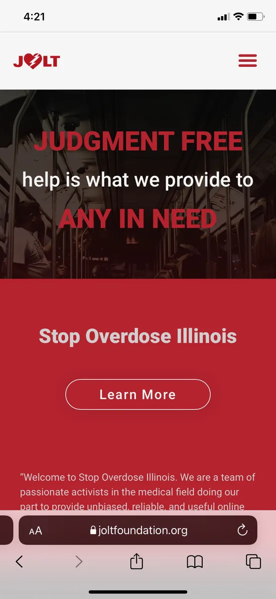
Home Page Website Screens —
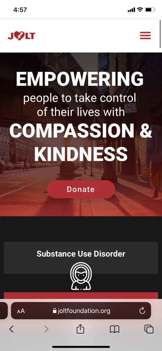
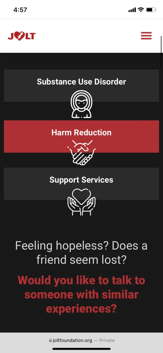
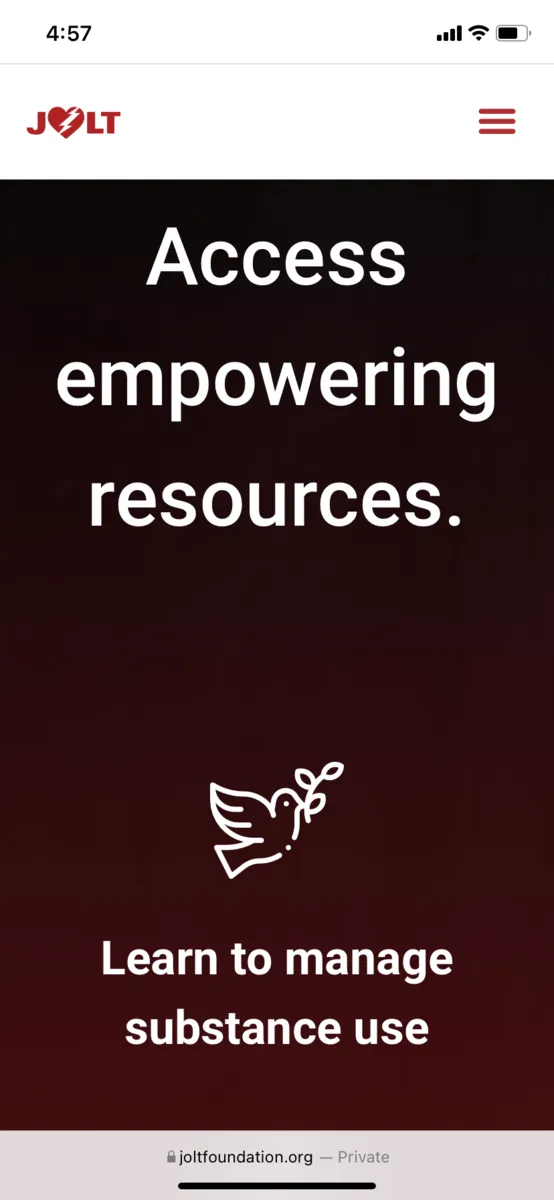
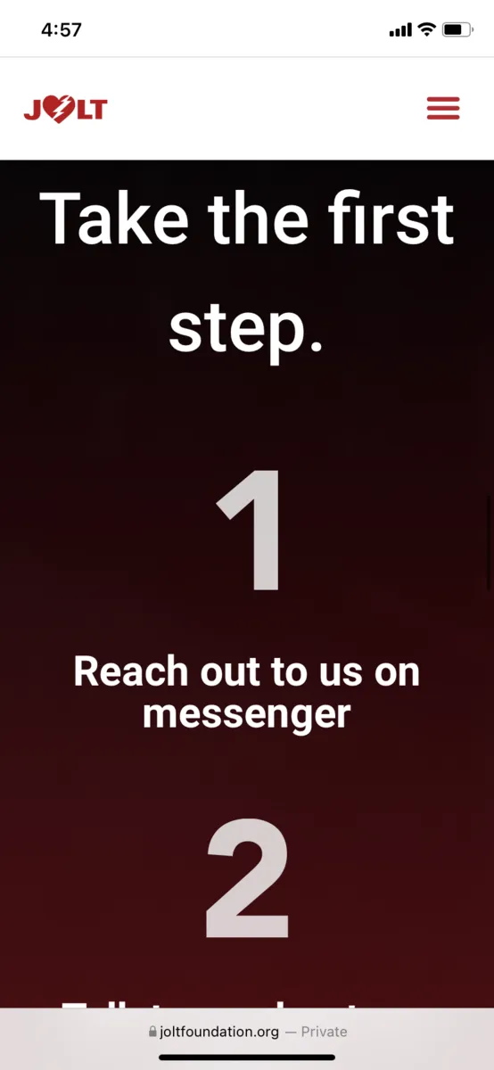
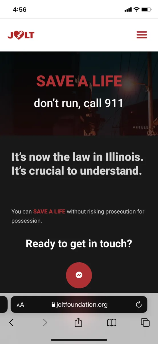
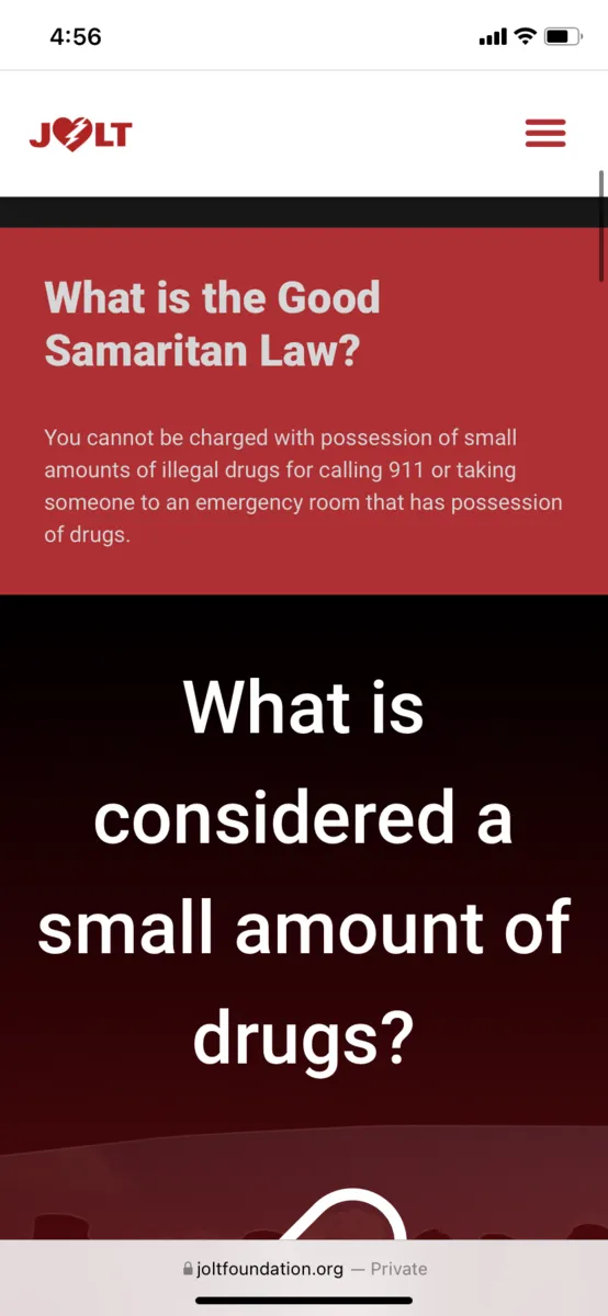
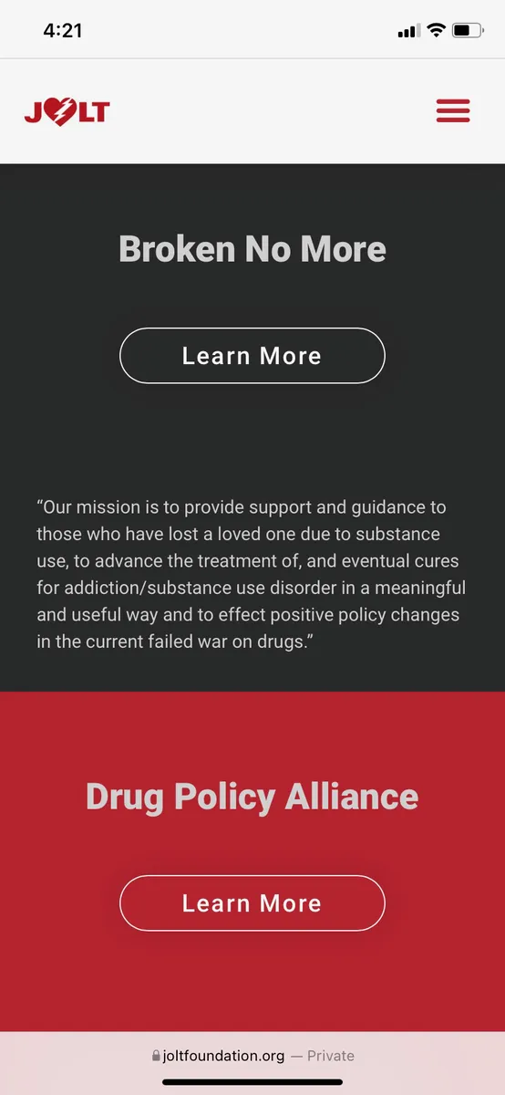
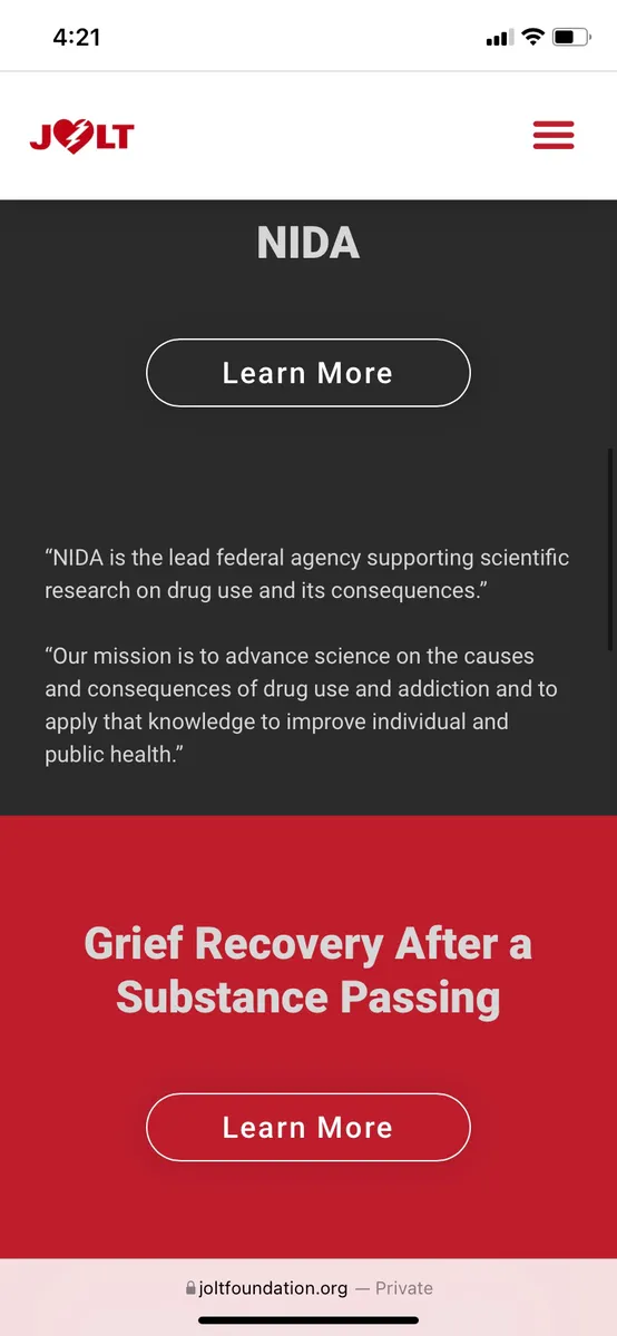
Home Page Mobile Screens —
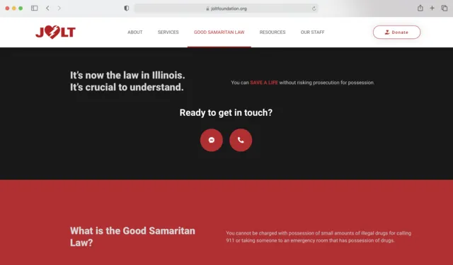
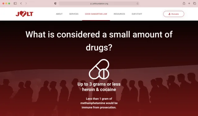
Good Samaritan Law Website Screens —
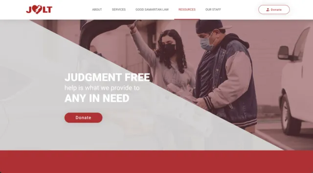
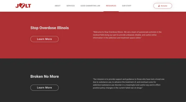
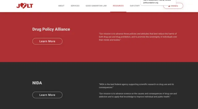
Resources Website Screens —
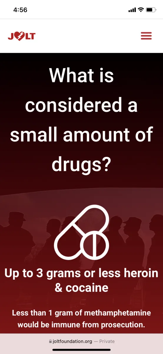
Resources Mobile Screens —
Results and Reflection
By following design principles that allow for a simple user experience, we made sure that the new website was easy for our users to understand. We learned that most homeless users tend to use Facebook Messenger to communicate so we included that as a feature to get in contact with JOLT’s team members. We found that a simple interface was very important for ease of use and faster load times for users without wifi or much technological experience.
Our client felt the new site did a great job in showing the most important features that JOLT offers in a more streamlined way. They were happy with the color scheme we went with and enjoyed the use of icons and imagery that hadn’t been there in the old site. The client felt that overall the redesign more efficiently displayed the important information about the business without compromising a modern design. Our team had a really great experience working on this site and we all feel we grew as designers and developers over the course of this project. We are very grateful for the opportunity.
What Went Well?
• The client was very pleased with our end product.
• We improved the overall user experience both visually and as a user is actively on the site.
• My work as visual designer was very important to the basic elements of the website and I felt I learned a lot.
What Didn't Go as Well?
• As visual designer I didn't have much to do near the end of the project as the development side worked on the building of the website.
• Some parts of the site are currently broken or can't be viewed on certain browsers and I'm not sure if that would be fixed in the near future.