Assigned the team lead, I worked in a group to design a kiosk for homeless shelters in the Peoria area, offering medical literacy and other helpful services.
The Client
This project was the product of a partnership with OSF and JUMP simulations. In working with the homeless they came to learn what needs commonly had to be met. With multiple shelters in the Peoria area and many homeless people needing support in the medical field, JUMP and OSF decided they needed to work together to make a change. OSF is the medical center in the city that offers a lot of help to the unhoused with faith community nurses and other doctors that want to be involved. JUMP simulations work hand in hand with them to create innovative solutions for medical education and care. We had the opportunity to work with them in designing a homeless shelter kiosk through our advanced user experience design course at Bradley University in Spring 2021.
The Problem
Currently, many homeless people lack easy access to doctors and oftentimes are unfamiliar with the medical literacy of making an appointment as well as basic medical needs for themselves. Homeless people may also be uncomfortable sharing things directly with a person they have never met before. Making a doctor’s appointment can be overwhelming and stressful for the everyday person and even worse for someone less familiar with services such as these. It can be hard to help someone learn medical literacy if nurses are not always available. The good news about a kiosk is that it is there to help even when real people may not be. A kiosk can offer help in ways that would make the whole experience much easier to undertake.
My Role
As team lead my job held many responsibilities. I would schedule and run meetings, asking each team member where they were at with their obligations and offer any help as needed. I would also communicate with our professor and clients to make sure our kiosk design was up to standard. I also did a most of the presentation to the client and would divide responsibilities amongst the team.
Timeline
This project was completed in Spring of 2021 for a class project. All research and design was done between January and May of 2021.
Tools
Adobe XD
Figma
Prototype
The User's Needs
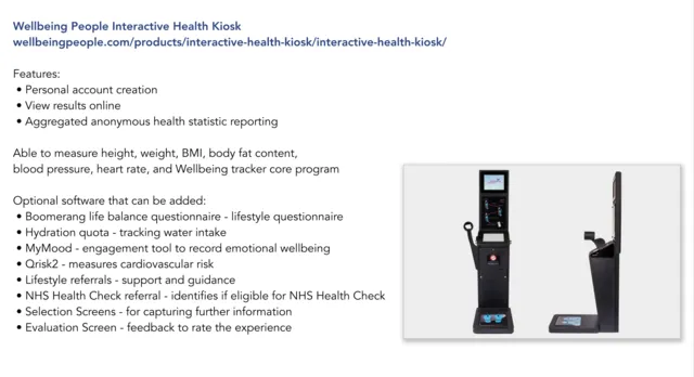
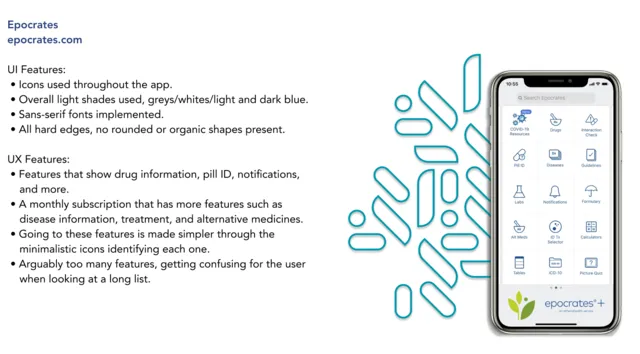
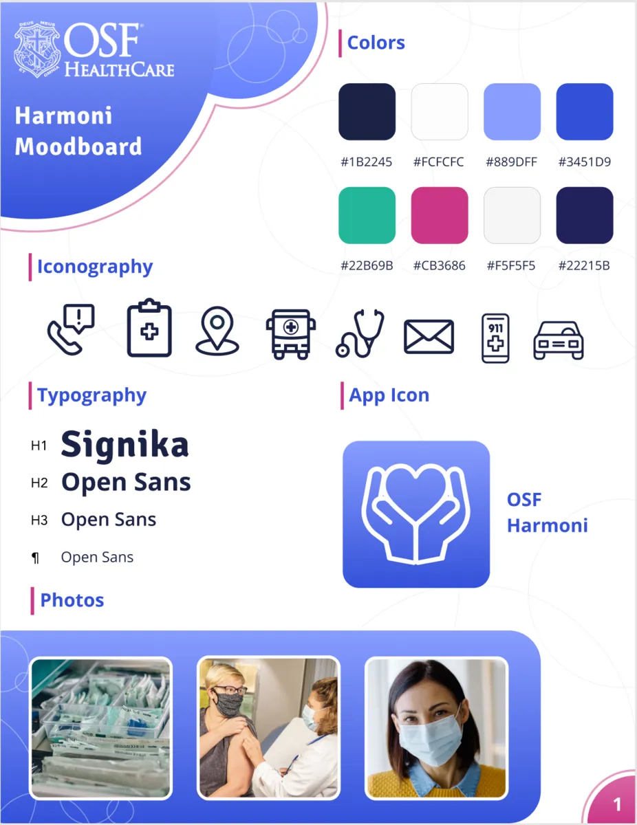
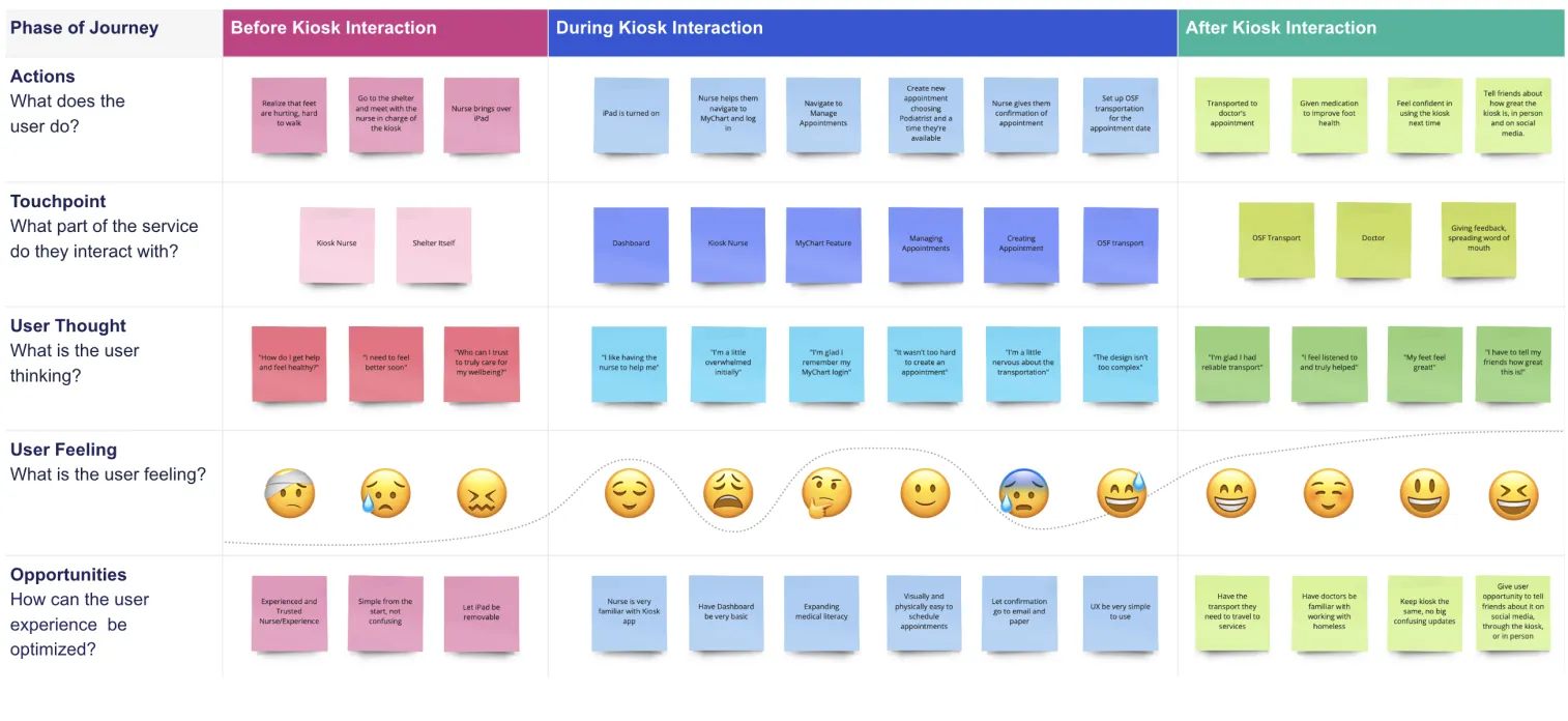
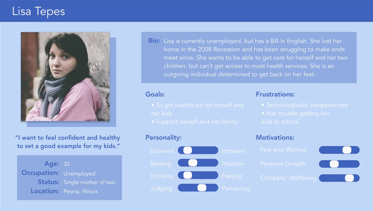
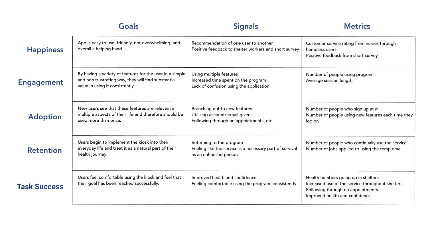
In creating this kiosk, my team and I knew it needed to be bright, simple, and friendly. We could see how overwhelming it can be and vowed to make sure it was accessible for everyone. We began by doing research on medical kiosks and apps to see which features would be most relevant. We then created a moodboard with colors and textures we felt best fit the concept as a whole. Next, we came up with a journey map persona, and heart framework to get into the head of an average user.
Competitive Analysis —
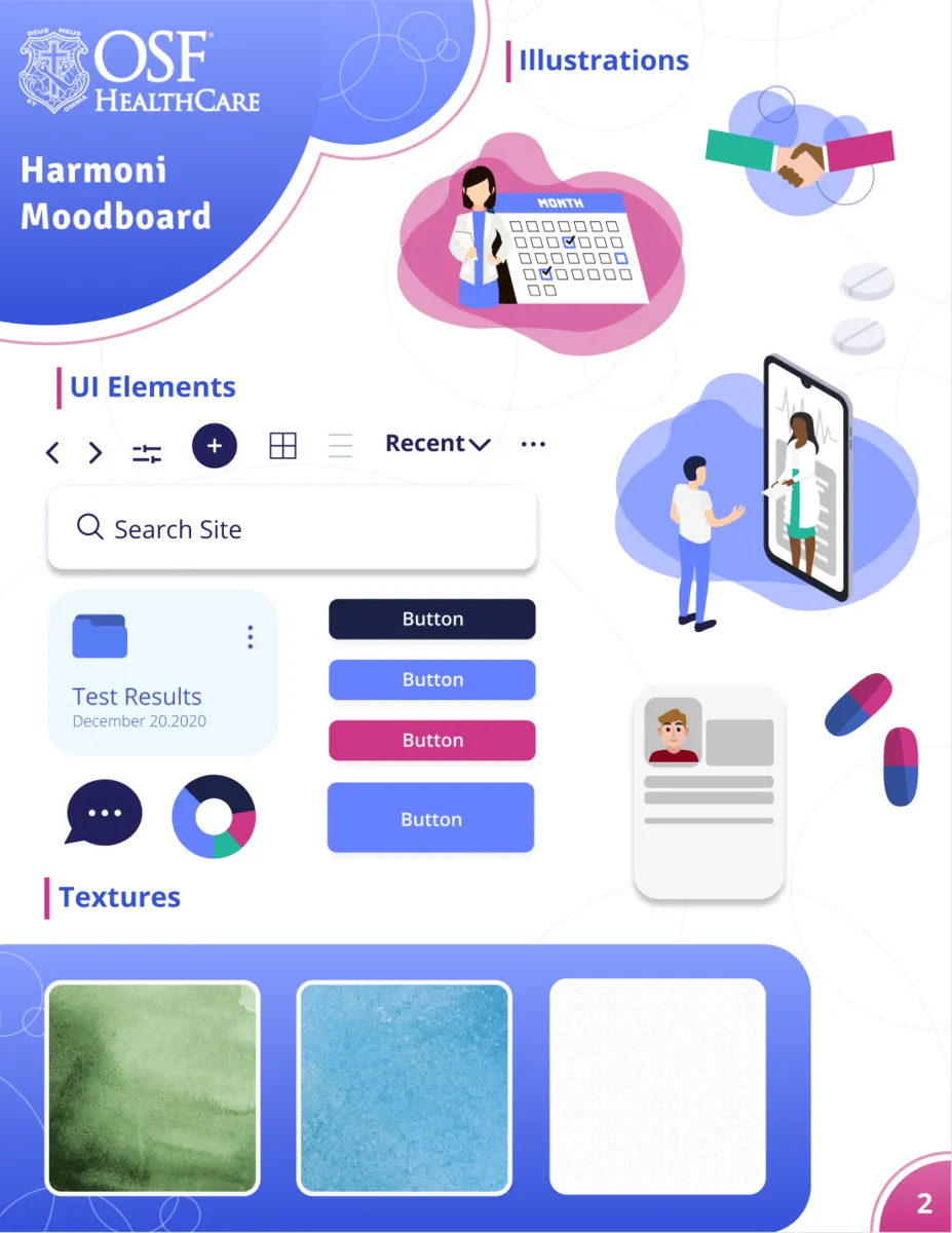
Moodboard —
Journey Map—
Persona —
HEART Framework —
Designing With the User in Mind
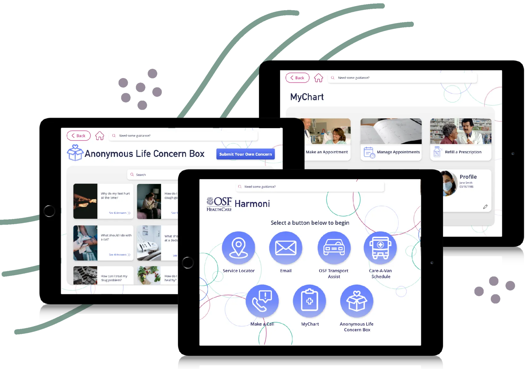
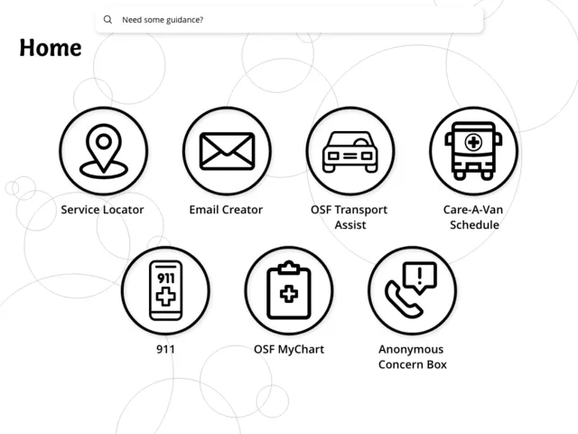
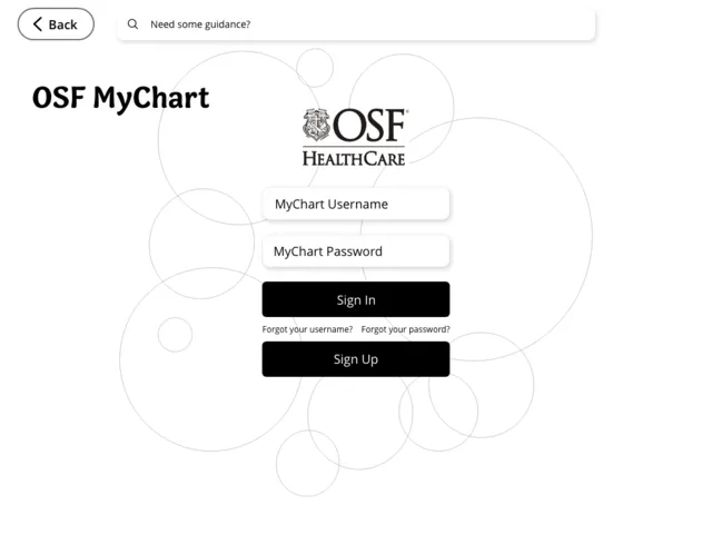
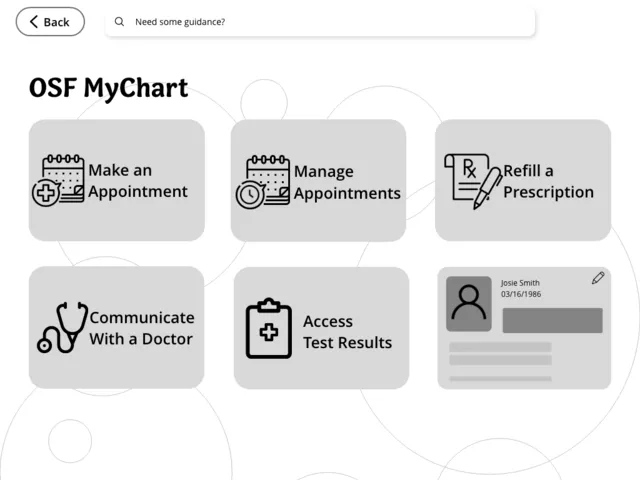
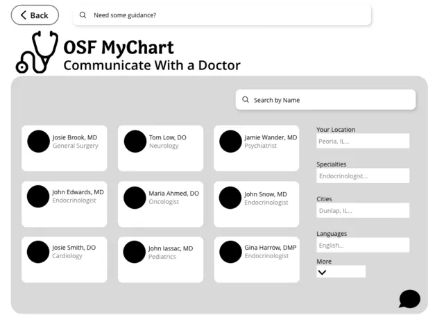
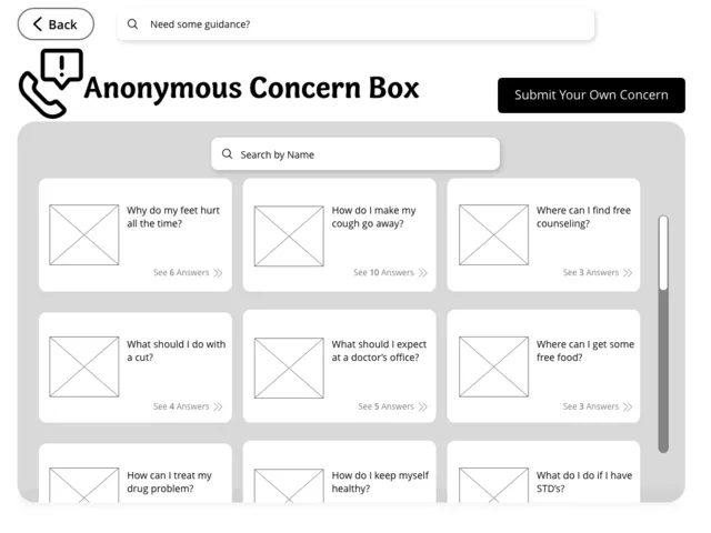
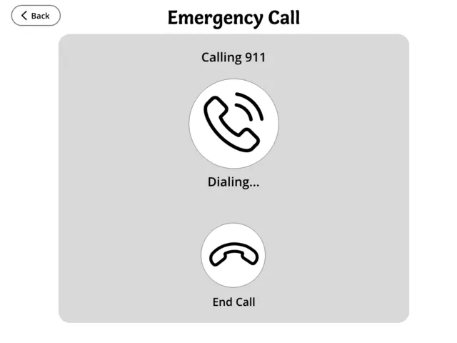
In the end the features that we decided were most important to include would be making an appointment with a doctor, checking test results, refilling prescriptions, a messaging system with doctors, creating an email, an anonymous life concern box for any medical questions, a service locator, a phone feature, and transport assist. I assigned each team member with a certain service to create flows for and we then began creating black and white wireframes.
We were able to begin the high fidelity wireframes using friendly fonts, welcoming circles, and simple colors. We felt that with these features it was imperative that we made the home page easy to understand with large icons and easy language. We made sure that every aspect would be uncomplicated and easy to navigate. For these wireframes and design documents, we used Figma and Adobe XD.
Lo-Fidelity Wireframes —
High-Fidelity Prototype/Screens —
User Testing
User tests were found to be highly successful. We met with a few nurses at JUMP and OSF. Most qualms they had were to do with verbiage we hadn’t considered. For instance, calling the anonymous concern box a life concern box, so it doesn’t seem to be connected to any concerns with the kiosk itself. Our transport system also was lacking as it didn’t yet feature a way to set up a transport appointment. They also wanted to see a way to check the email that they had created. We did fix all of these issues and feel the kiosk was much better for it.
Results and Reflection
We would frequently be meeting with the client for any updates on this project and each time the client would praise each team’s designs. In the end, the client was very excited to get started on developing the kiosks for implementation in the individual shelters. Our team specifically was praised for the minimalism and easy navigation our designs provided. Overall, I had a very enlightening experience working as team lead with this client and would love to work with them again in the future.
What Went Well?
• This was my first experience as a team lead and we were overall very successful and I was praised for my leadership abilities.
• This project gave me a lot of confidence in my communication and presenting skills as a whole.
• Our team was chosen as one of the client's favorite designs overall.
What Didn't Go as Well?
• Could have used more user testing with actual homeless individuals so we know what it's like being used at a shelter.
• More insight into what the users were interested in would have been good too as most of our interviews were from those working at the shelter not the people who live there.