Working with Lifting Up, LLC to redesign their upcoming entrepreneur tool with a UX design perspective.
The Client
Lifting Up LLC is a sibling owned start-up working to leverage technology to make a difference. As they began to build the business itself, they faced challenges accessing timely and appropriate resources and support in their community. They soon realized this is a common challenge, and so began the SmartStart Dashboard for customized entrepreneur journey guide. I was connected with them through my professor and advisor and began working with them June 2021 on a project important to the small businesses of their community.
The Problem
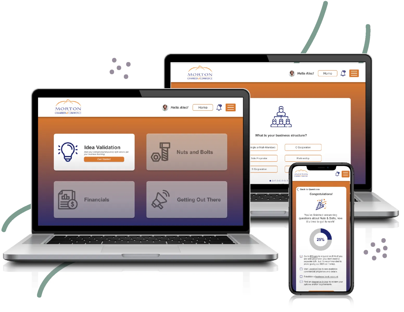
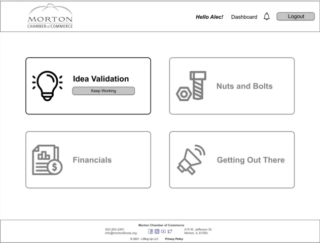
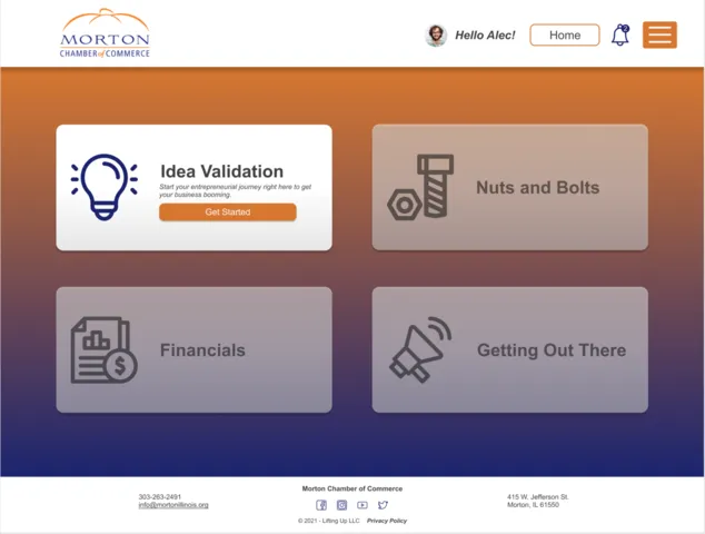
SmartStart is Lifting Up’s web application meant to guide and encourage entrepreneurs as they build their business. The website also serves as a platform to connect the entrepreneurs to local professional experts along the way. SmartStart offers four sections to guide the user to through the logistics of starting a business, including: idea validation, basic nuts and bolts, financials, and marketing. With all of these sections there are personalized questions to ask and corresponding tasks to complete.
This project came to me with all of the structure complete. My job was to enhance the design to be more user friendly and to more closely follow UI/UX principles. For this project I would be redesigning their current website design as well as designing a mobile version of the site.
My Role
As the sole UX Designer in this project it was my job to do any research on the user and then redesign their current screens to be more visually appealing and user friendly.
Timeline
I was offered this project through my mentor Heather Ford during the summer of 2021. I was able to be introduced to it and complete it between June and August.
Tools
Figma
A Boxy Original Design
The visual design itself had great bones but some design features weren’t servicing the user as well as they could be. Boxes were very straight and structured, there was little imagery or personal language, and some aspects could be seen as confusing without some encouraging instruction to help the users along.
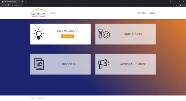
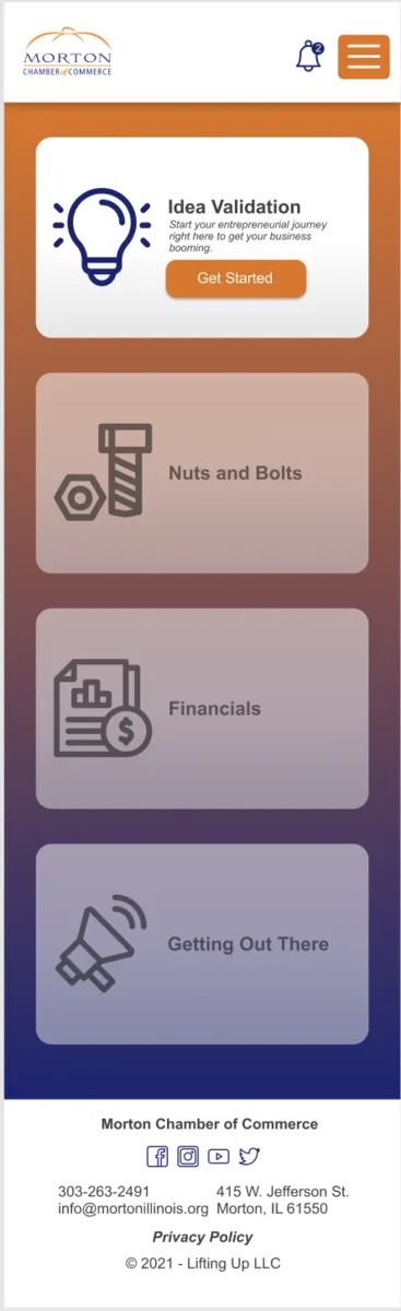
Main Page —
The design here is boxy, with a poor use of a gradient and centered buttons that feel a little awkward.
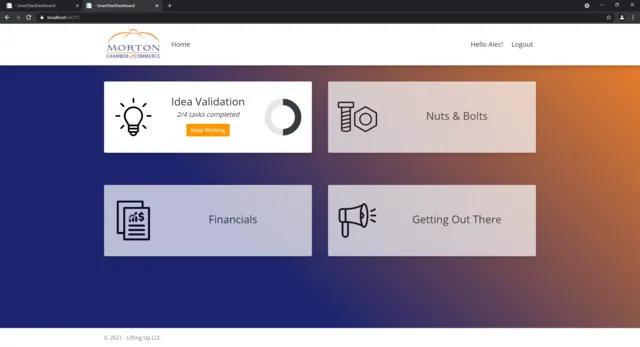
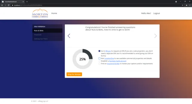
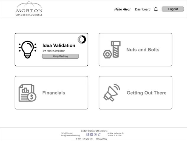
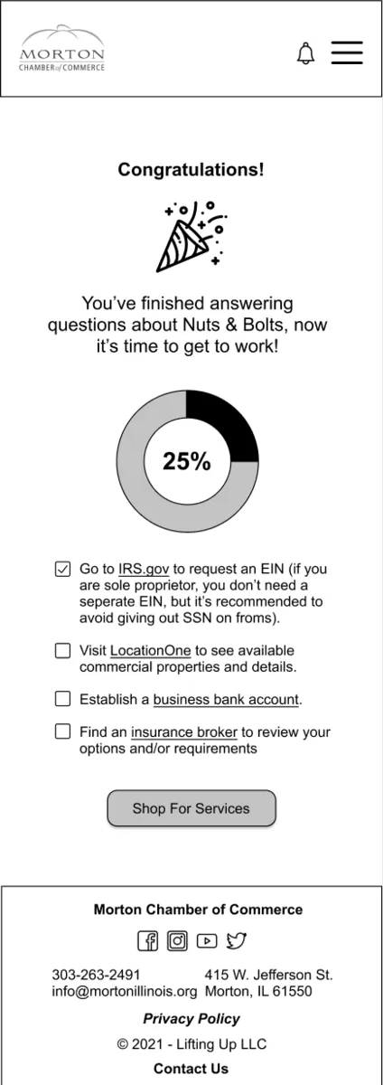
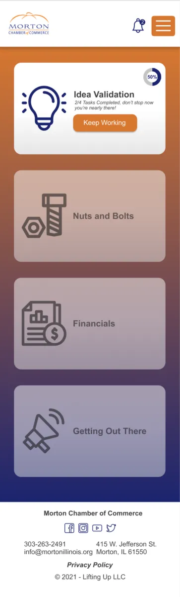
Home with Tasks Complete —
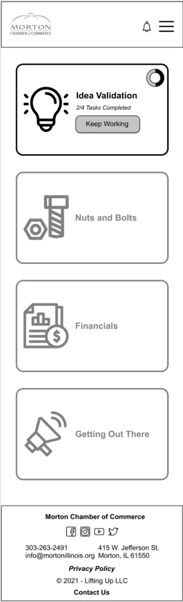
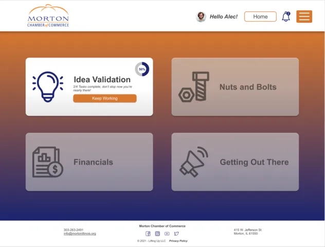
The progress circle lacks a descriptor for how far along the user is and overall feels a little strange on the card.
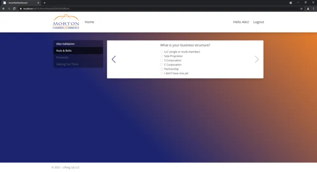
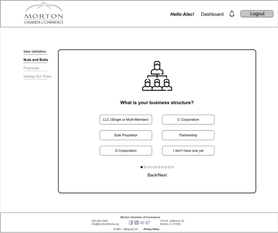
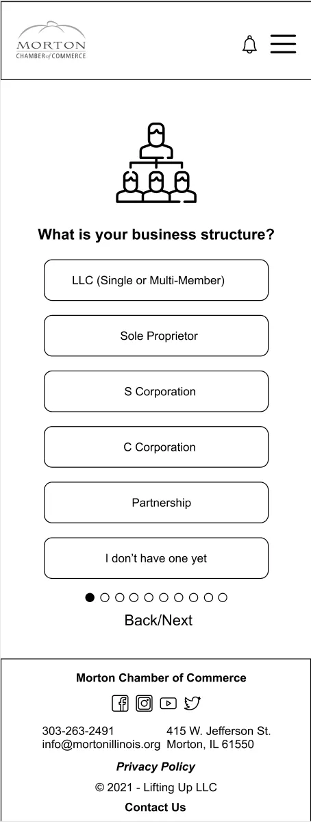
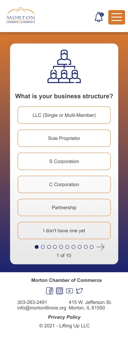
Questions —
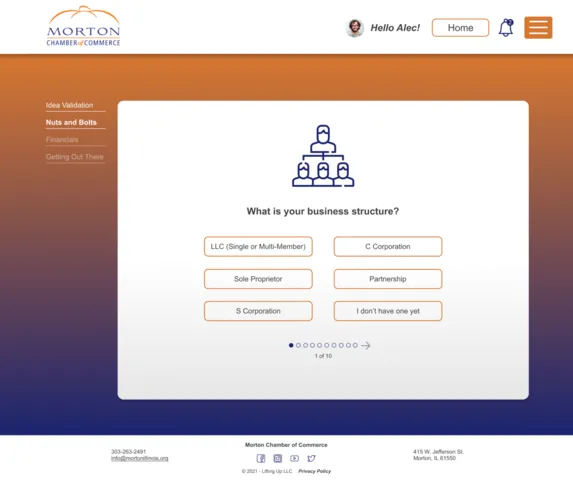
The questions here feel cramped, there's no progress that informs the user how many more are left, and it just feels uncomfy.
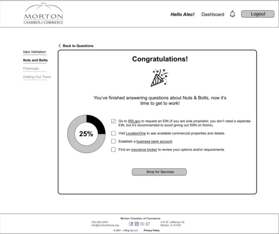
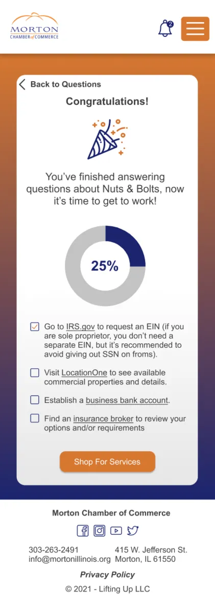
Nuts and Bolts Tasks —
There's not a lot of hierarchy on this page and the text doesn't feel evenly spread out with a proper amount of white space.
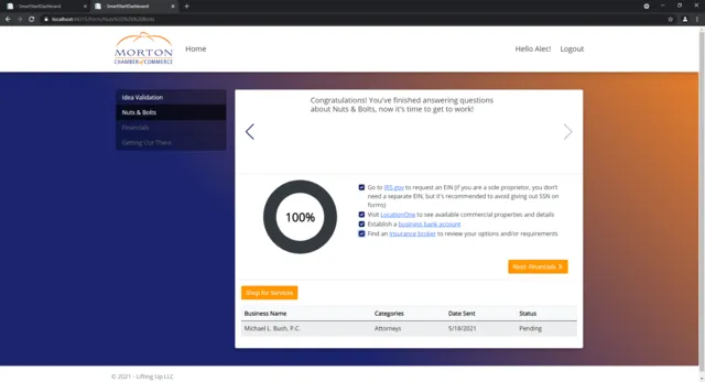
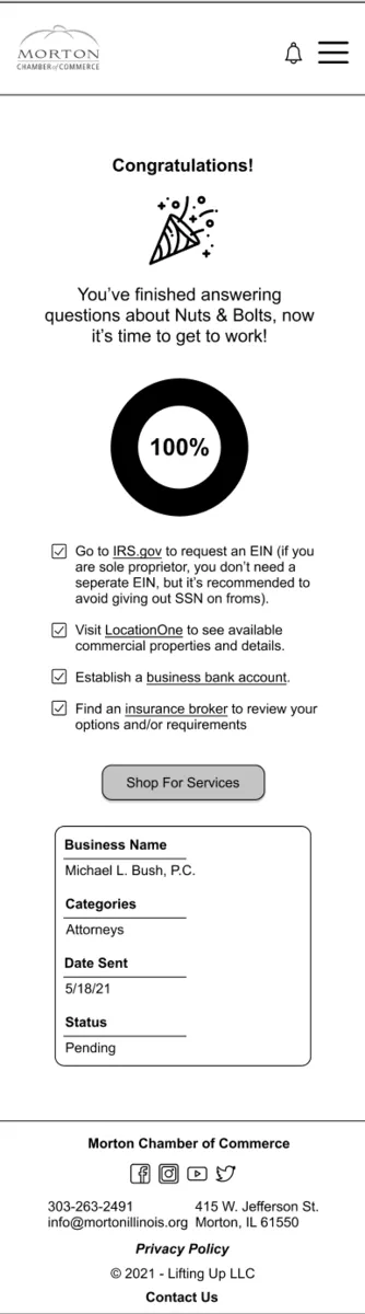
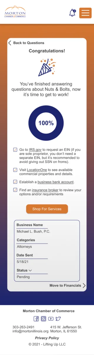
Nuts and Bolts with Tasks Complete —
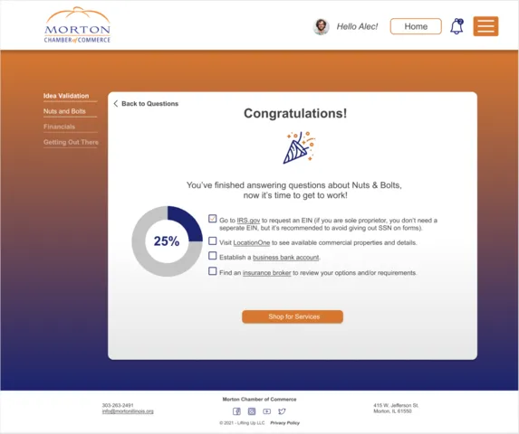
Same critiques as the last screen but here there is a table that could also use some hierarchy and better spacing.
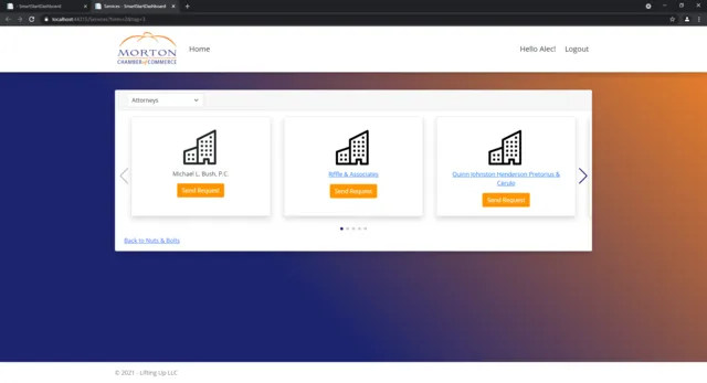
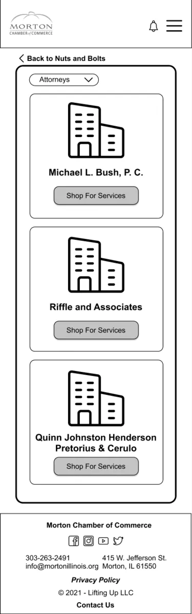
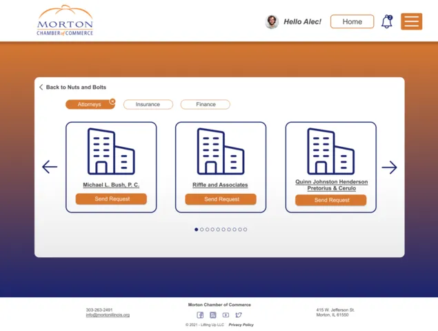
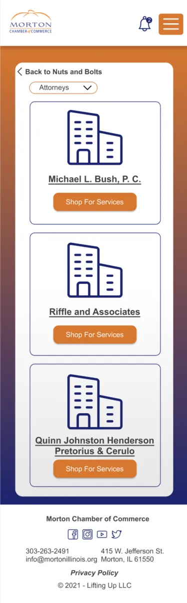
Services —
Could use more white space and room throughout as well as a better way to visualize a link.
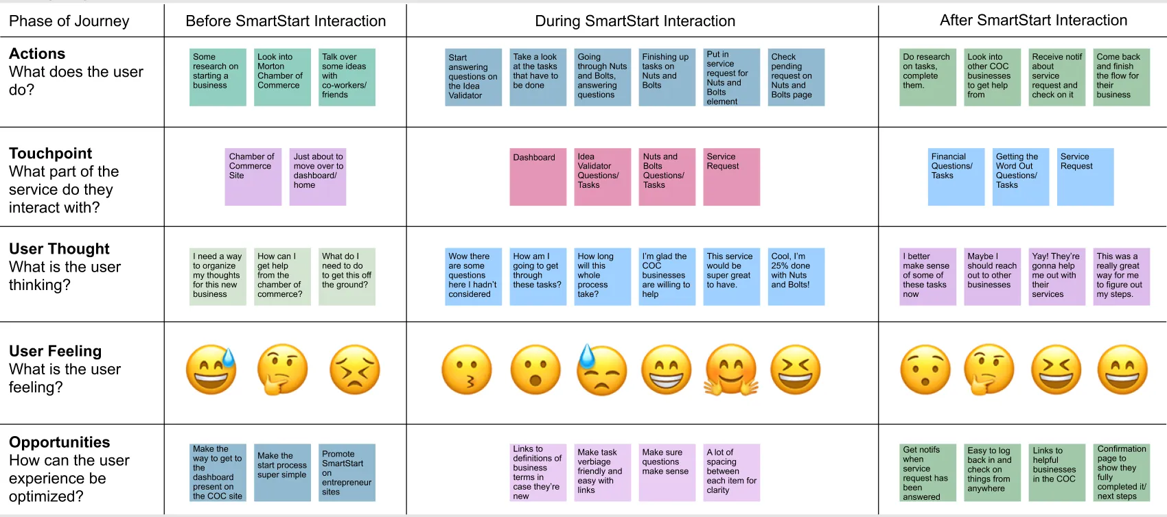
Researching and Lo-Fidelity Designing
Given the shorter time frame the only research I did here was in creating a journey map to understand how a user would demonstrate going through the whole process of the program. From there I started designing.
Journey Map —
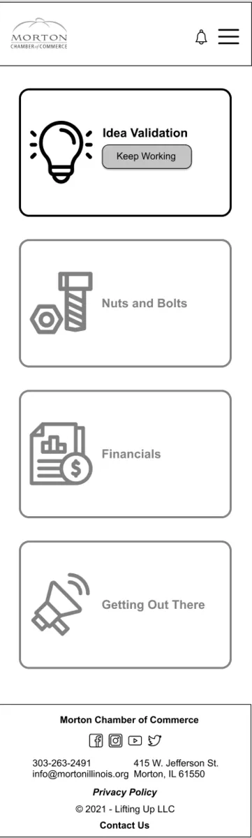
I came into this project knowing I wanted to make the application more friendly and visually appealing. The colors came from the whitelabelling of their first client—a local chamber of commerce. Each iteration of this program would have different colors based on the client. The other visual changes I made here were rounding out many boxes, creating more white space, and the inclusion of icons as a part of the questions and in other places as well.
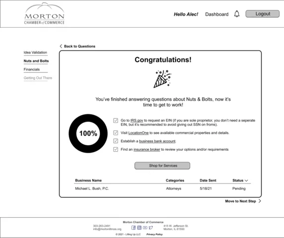
From a UX standpoint, I was sure to include more helpful language to guide the user toward the proper path and make a painless path throughout the web app. To begin with, I started with a journey map to really get inside the head of the user. I also introduced the concept of a notification bell to encourage users to return to the website if it had been a few days since they logged on or received a message from the chamber or one of the businesses. Another aspect I felt was a good idea to include from an instruction standpoint was coach marks at their first login and other initial visits to sections of the program. We ended up following a road map style with a handwritten font style and arrows directing them to the usage of the application.
Lo-Fidelity Website Screens —
Lo-Fidelity Mobile Screens —
Final Designs and User Testing
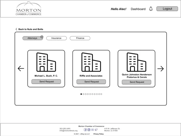
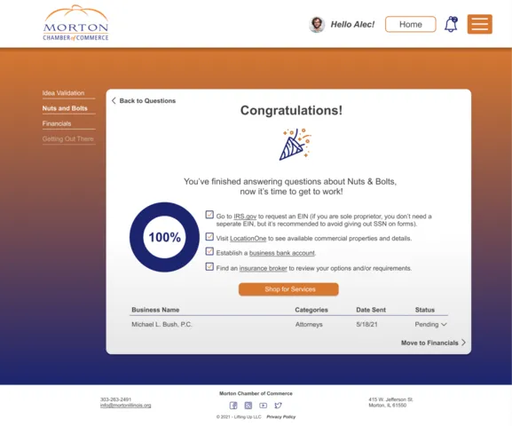
After getting feedback from my client I then got to work on high fidelity screens following the principles I went over above. I then facilitated a user test with a successful entrepreneur with many years of experience with various chambers of commerce and the growth of his own business. He saw the value in this program for new entrepreneurs and even had some ideas for a phase 2 of this plan. He wanted to make sure that in the services page with businesses in the chamber, website links were also included. Overall, he really enjoyed the design changes that were made and felt that this would be a great tool for anyone interested.
Hi-Fidelity Website Screens —
High-Fidelity Mobile Screens —
Results and Reflection
I had weekly meetings with the client and each time they would have great things to say about my designs. We would often spend an hour or so discussing what additions could make it even better and in the end they were very satisfied with what I was able to come up with. Overall, this was an amazing experience and I cannot wait to see the program implemented fully with the various chambers they will work with.
What Went Well?
• The client was really happy with the outcome, they saw a huge difference in how the program felt to use.
• They have a plan to do a second round of design changes that would add in some gamification and social aspects.
• I feel a grew as a designer and got the opportunity to work with a developer as I never had before.
What Didn't Go as Well?
• Throughout the project I had to learn how to say "I don't know" in regards to certain development questions which was a bit of a learning curve.
• I didn't have time to do full research as I would have liked and felt like some more insight to the user and entrepreneurs as a whole would have improved the overall design.