In an internship, I researched and designed a wayfinding app for Wildlife Prairie Park working alongside
two animators.
The Client
Wildlife Prairie Park is a wildlife conservation on 1800 acres of land in Hanna City, Illinois. It features animals that are native to Illinois such as bears, coyotes, bison, elk, and badgers. The park also has many lodgings, tent camping, fishing and kayaking lakes, and hiking and biking trails. I was given the opportunity to intern for them working on a project with two animators to do the UX design for a wayfinding app.
The Problem
Wildlife Prairie Park has so many amazing features, a person could spend a whole week there and not see and do everything they offer. People have said that many of the activities at the park, they had no idea about! They have a hard time knowing what’s there, where it is, and how to get there. Currently, there are multiple brochures and maps showing where things are and what there is to do. However, the information may not be fully up to date, the maps could be slightly off, and there just isn’t a cohesive place to see all that the park offers.
This is where a wayfinding app comes in. Wildlife Prairie Park has been open since 1978 and could use to begin modernizing itself for the new millennium, an app will not only show that it can compete technologically with other conservations, zoos, and aquariums but offer a new way for park visitors to experience Wildlife Prairie Park.
My Role
As the UX designer of this project, I worked both on the research and design sides. I worked alongside two animation majors, their job being creating a large map, icons, and any other visual assets. I worked on competitive analysis, personas, and journey maps as well as the visual design of the application, making sure UX principles were followed.
Timeline
This was an internship completed in the fall semester of my senior year at Bradley University. It was fully researched and designed by December of 2021 having started in August of that same year.
Tools
Figma
Adobe Illustrator
Google Forms
Trello
Prototype
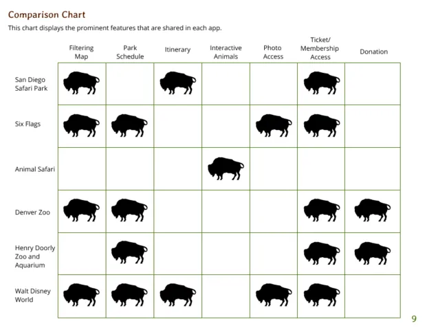
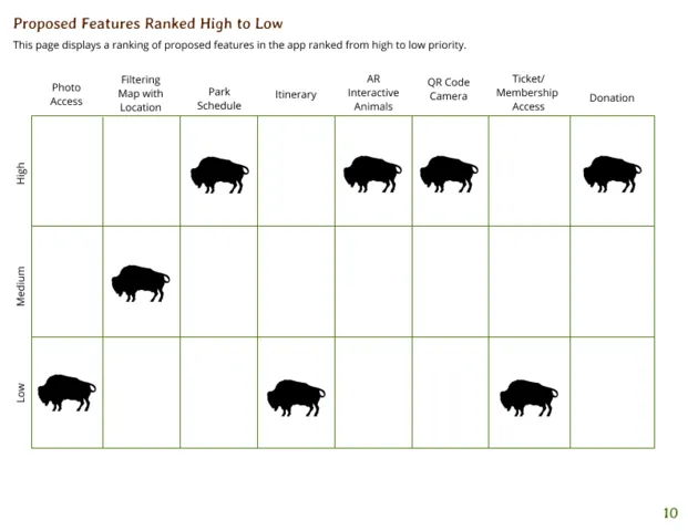
Researching the Competition
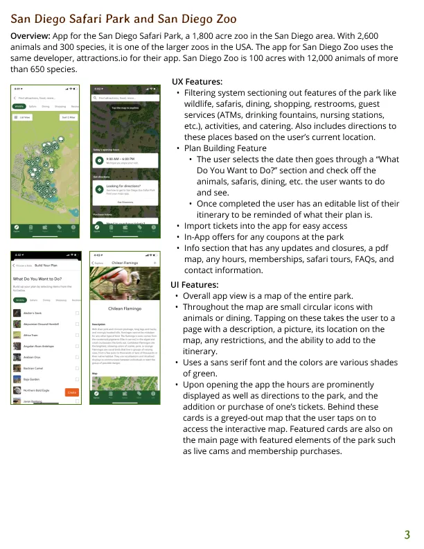
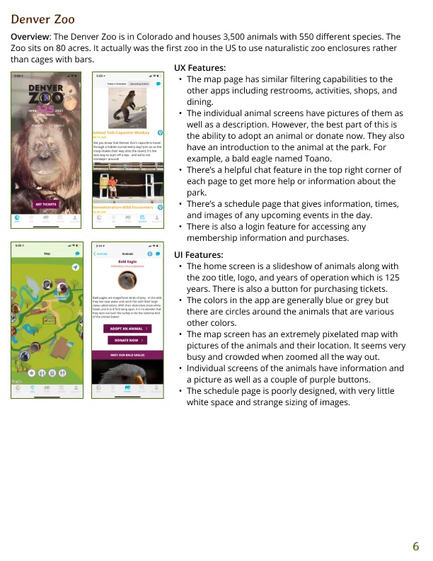
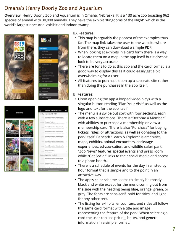
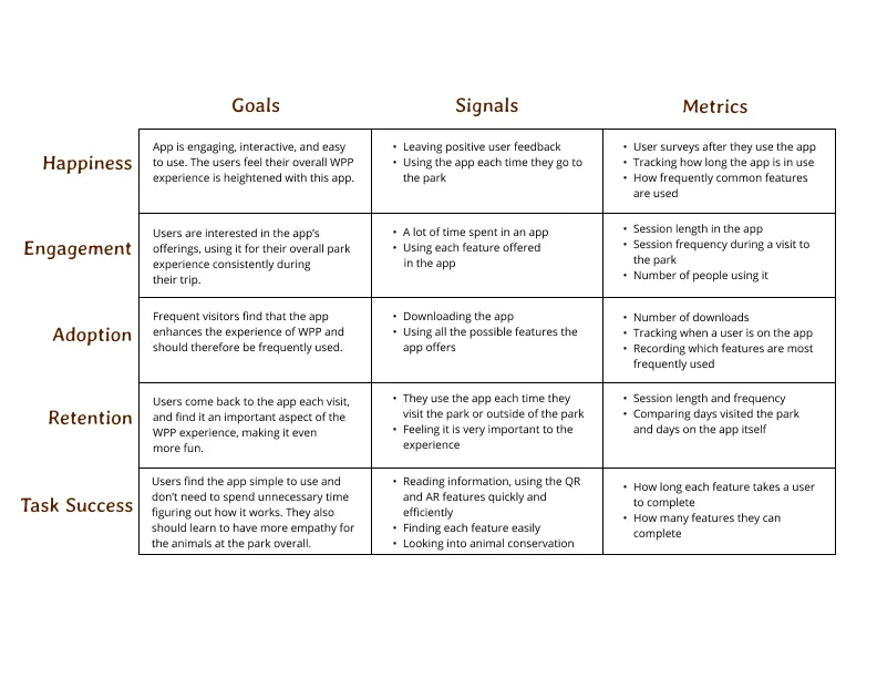
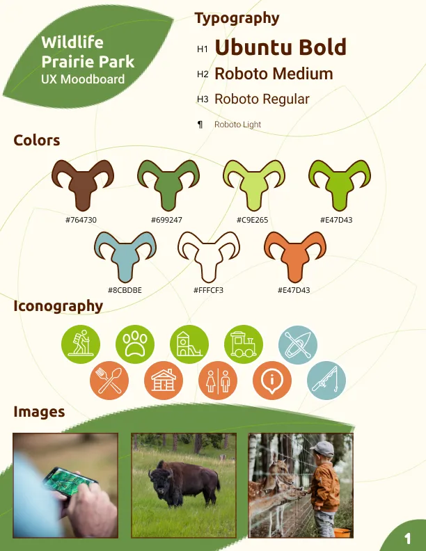
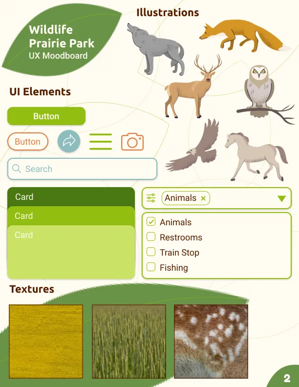
I started with a round of competitive analysis, taking a look at what the other apps in the industry were doing. I found which features were commonly used in apps for zoos like the San Diego Zoo, the Denver Zoo, and the Henry Doorly Zoo in Omaha. I took these features and ranked them in order of importance to incorporate in the Wildlife Prairie Park app, including a wayfinding map, camera access, upcoming events, and park schedule. From there, I made a HEART framework and a UX moodboard with typography, texture, iconography, UI elements, and more.
Competitive Analysis —
Important Features —
HEART Framework —
Moodboard —
Understanding the User
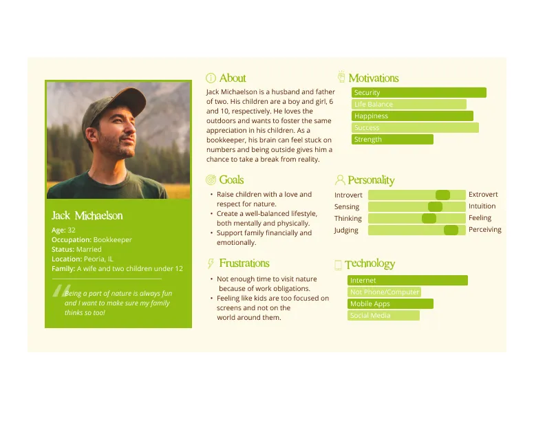
Next, I created a user survey and shared it on the park’s social media, resulting in over 100 responses. After asking questions about who they were, how frequently they went to the park, what their favorite features were at the park, and what would want to see in the app, I gained a lot of information. For the most part, families would spend three to four hours at the park and visit every few months. Their favorite activities would be the train that traverses the land, visiting animals, and hiking. In terms of what they wanted in an app, they really just wanted to know where they are and where they were going.
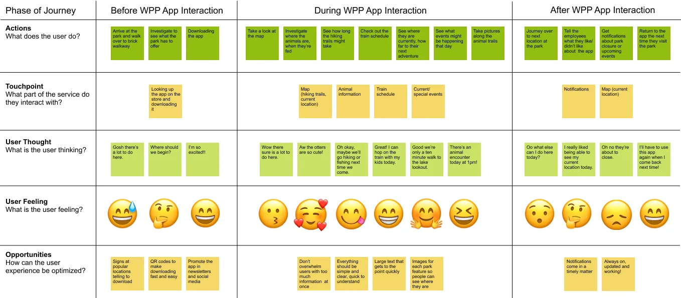
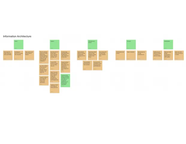
With this information, I knew the wayfinding portion and overall information about the park’s features would be moved to the top of the list. With those survey results, I made a persona, and then a journey map, understanding what the normal path of a user would look like before during, and after using the app. Next I worked on features and functionality as well as the information architecture for the app to know which features would definitely be in the app. As I started working on sketches I also made some user flows to understand how a user may traverse the app to accomplish their tasks.
Persona —
Journey Map —
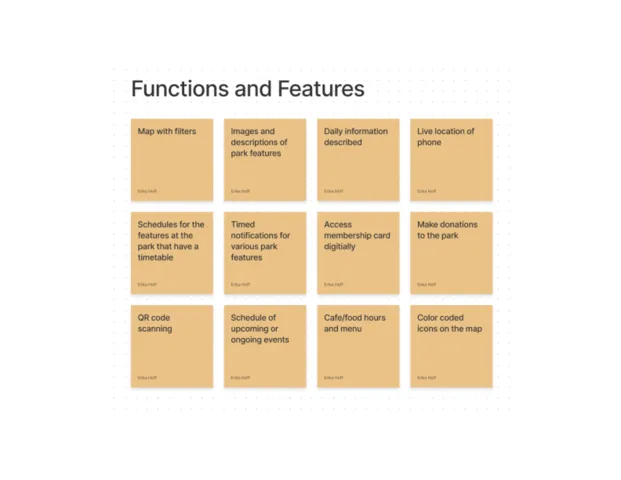
IA and Functions and Features —
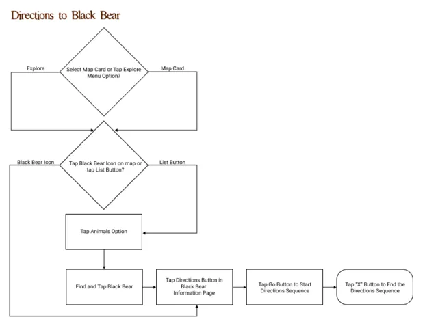
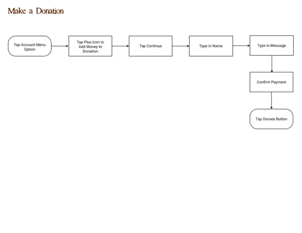
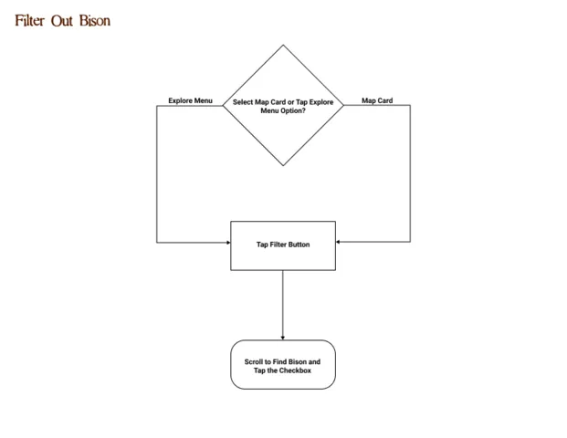
User Flows —
Designing for the Park
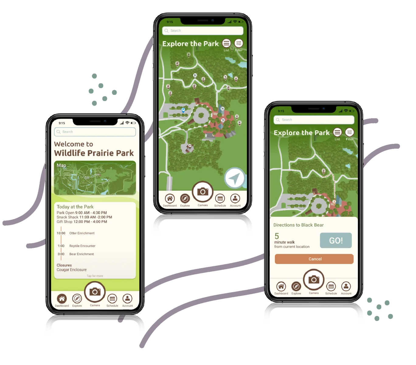
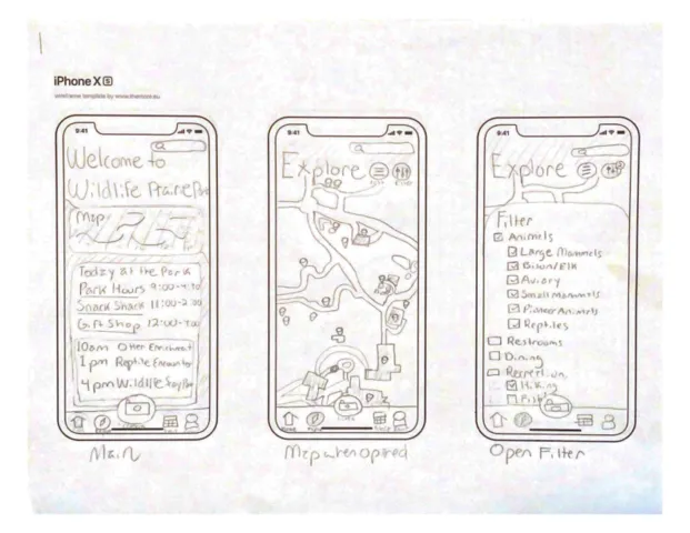
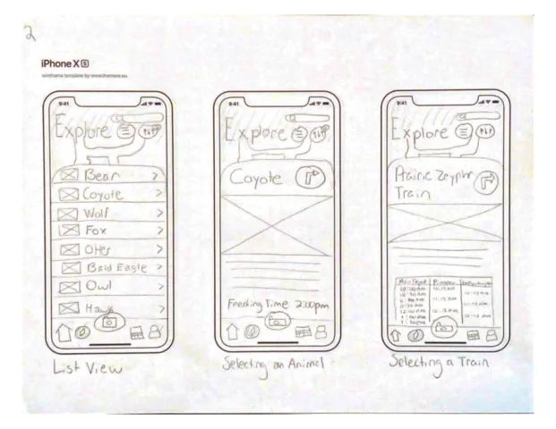
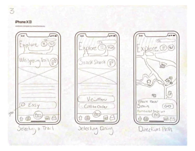
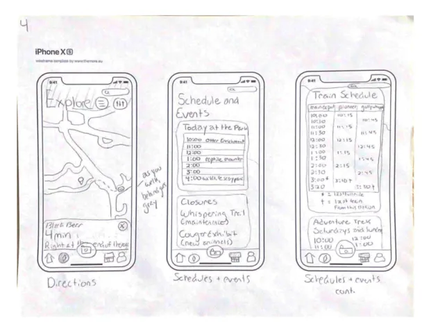
My next step was working on the high-fidelity screens for this app. Using Figma I consulted my sketches and UX moodboard to decide what the overall feel of the app would be. I started with a dashboard screen but then moved onto the map featuring a list view of all the amazing park features, a way to filter out certain elements, and a description of each feature the park held. Users would be able to find out the train schedule, call to order food, learn about animals and their feeding schedules, know how difficult a hiking trail is, and much more. I also made sure to include a directions feature so users understand how to traverse the park and get to their favorite places there. A schedules page would inform users what the park has to offer today, train and bus schedules, and any upcoming events. Finally, through the account page, users are able to view their membership card and information, call and order food, or make a donation to the park.
A Few Sketches —
Hi-Fidelity Screens/Prototype —
Testing with Users
I conducted two rounds of user testing and had great results. Any trouble with the app typically had to do with the general unfamiliarity of the app, some prototyping mistakes on my end, or some language difficulties. Since I tested with other UX students, they also had some insight into the adjustments of some icons, colors, and prototype animations. After making some changes I tested with one more individual who visits the park and is less comfortable with technology. She really liked the app overall and was so happy to see everything the park had right at her fingertips.
User Testing Results —
Results and Reflection
The results of this app were incredible. Our client was “blown away” by the work my animator peers and I did. She really loved all of the colors, the little details that improve the user experience, and the icons and map the animators designed. She told us she’s been clicking through the prototype for her coworkers and everyone is very impressed. I personally can’t wait to see this app developed and hope to be able to visit the park with the app in my pocket.
What Went Well?
• I was successful in being the only UX designer on the team.
• I was praised for my skills and earned a 100% in my capstone class for this project.
• I learned more about how to work with a client that has little to no knowledge on UX principles.
• The developer they met with asked which UX company did the designs, when it was really me!
What Didn't Go as Well?
• More elements of the design could have been fully fleshed out. Such as the ordering food feature and sculpture walk game.
• I would have liked to have more time to do more user testing with people as they are visiting the park to get even more insight ontheir experience. Also just user testing in general I feel I could have used one moreround.
• Seeing the app on my phone as I go through the park itself rather than just on my laptop would have also given more insight than I got.